Octanom
-
Landing page
Landing page for a FinTech company building platforms in the financial markets space for India and the U.S.

Tools
Figma — Design, Animation & Prototype
Adobe Photoshop — Device Mockups
Adobe Illustrator — Icons
Problem
Octanom faces the challenge of developing a compelling landing page that effectively showcases the two new product launches, Hedged and Greein. The goal is to highlight the robust features of both platforms and demonstrate how they can empower users to manage their finances and investments more effectively.
Solution
Develop a UI that is easy to use, visually appealing, and aligns with our brand identity
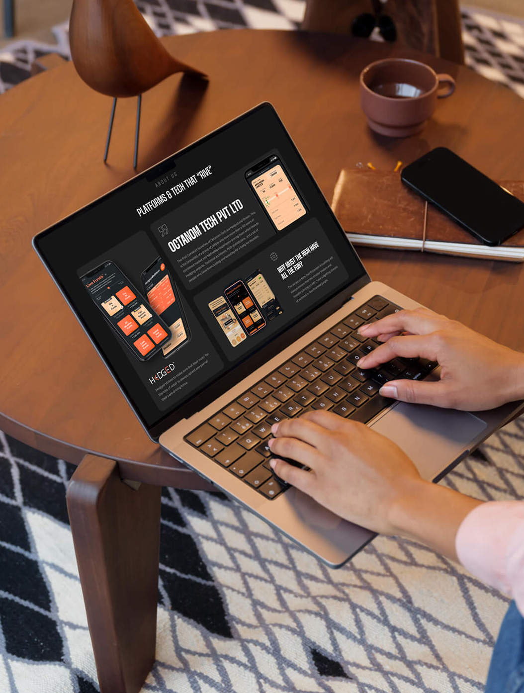
Showcase two platforms beautifully with the use of mockups
Ensure that the UI design meets the needs of our diverse user base, which includes both novice and experienced investors
Ensure that the design is responsive and accessible across different devices and platforms.
The Wireframe
We began by creating wireframes to outline the user interface design. The wireframes served as a blueprint for the project, outlining the basic layout, functionality, and content of the interface. We worked closely with the client to ensure that the wireframes were aligned with their business goals and user needs.

The Design
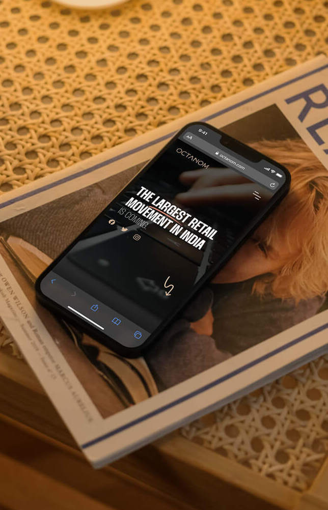
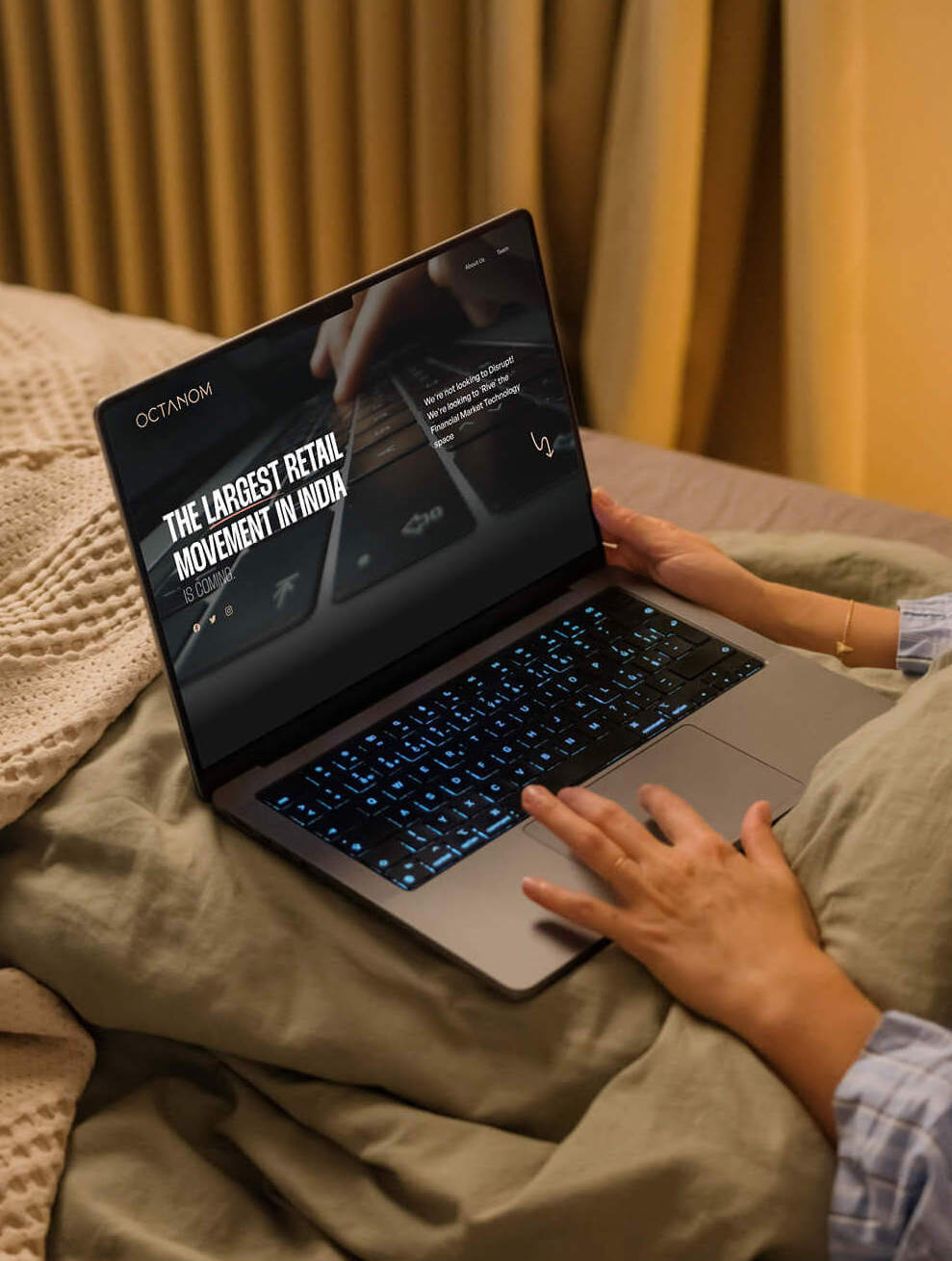
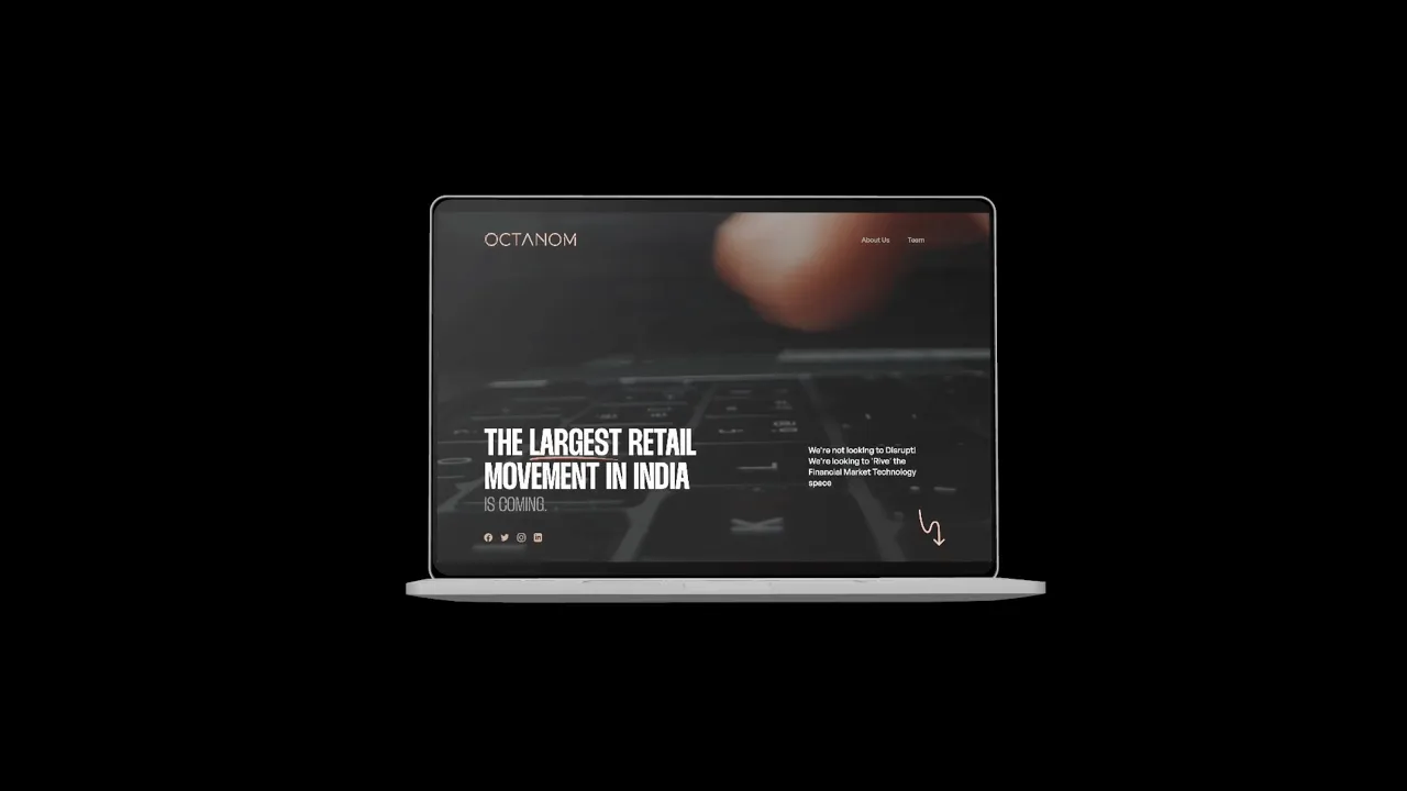
Hero Section — The Hero section is composed of two text buttons that are strategically anchored to important sections for effortless navigation, a prominent title, and animated text that portrays a user typing, complemented by a video background. Additionally, we have incorporated clearly visible social media links to aid the user in accessing Octanom's financial content across various social media platforms.

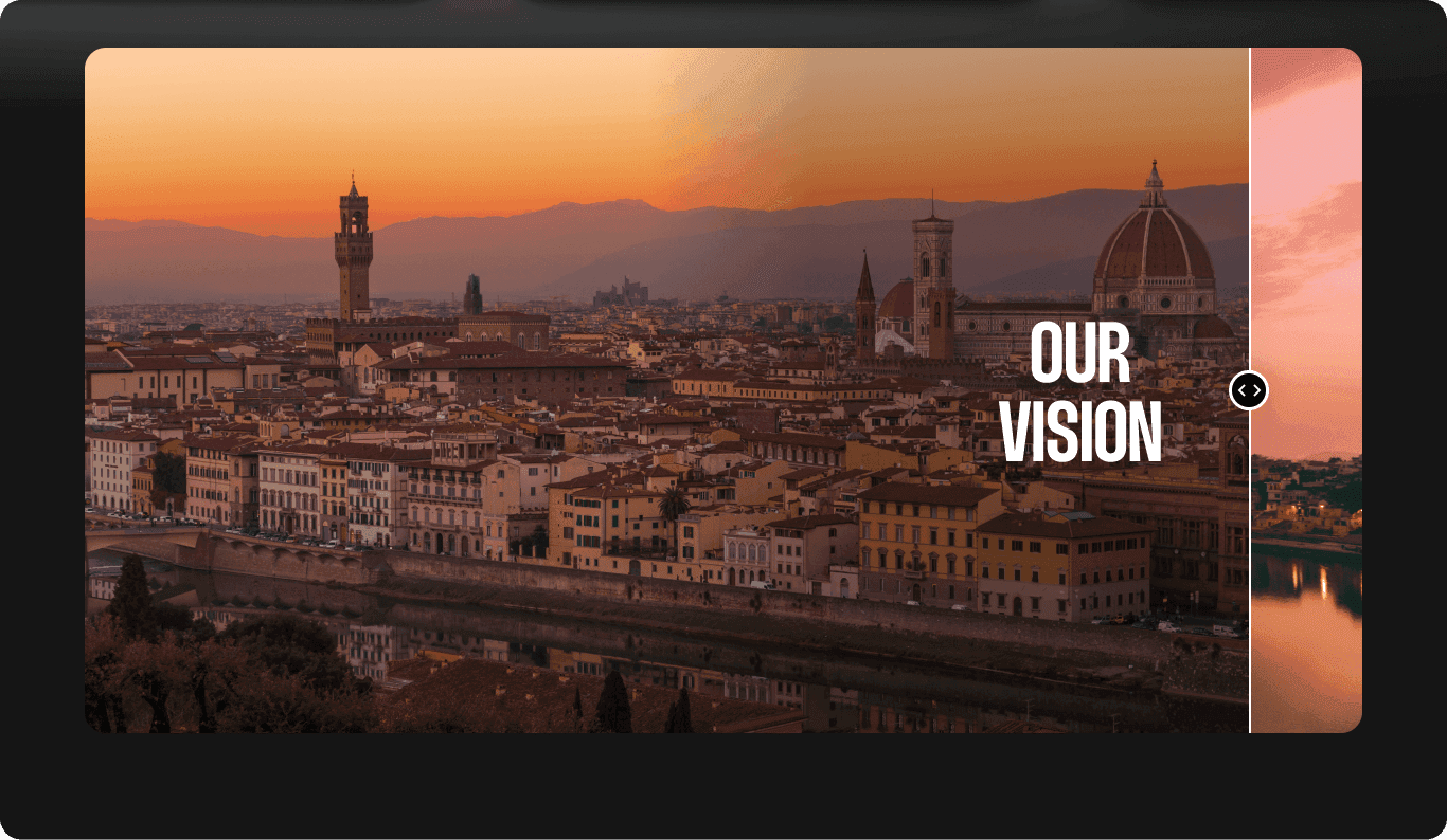
Below the fold — Incorporating company's vision and mission statement, alongside its statistical data, below the fold which serves to enhance the user's comprehension of the organization's size and scale.
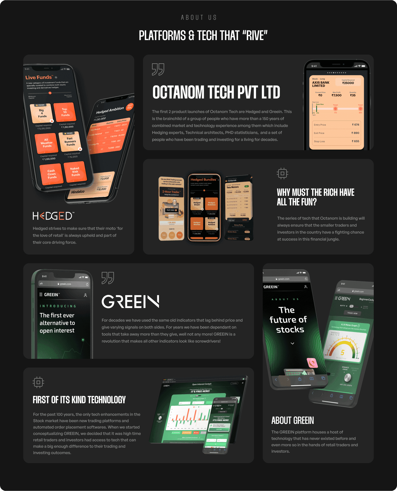
Product Showcase - We used a card-based design to showcase the mockups and details of the two platforms, making the landing page shorter, reducing scrolling, and facilitating the consumption of structured content. This approach avoids long texts and improves content scannability, leveraging the simplicity and aesthetic appeal of Card UI designs.
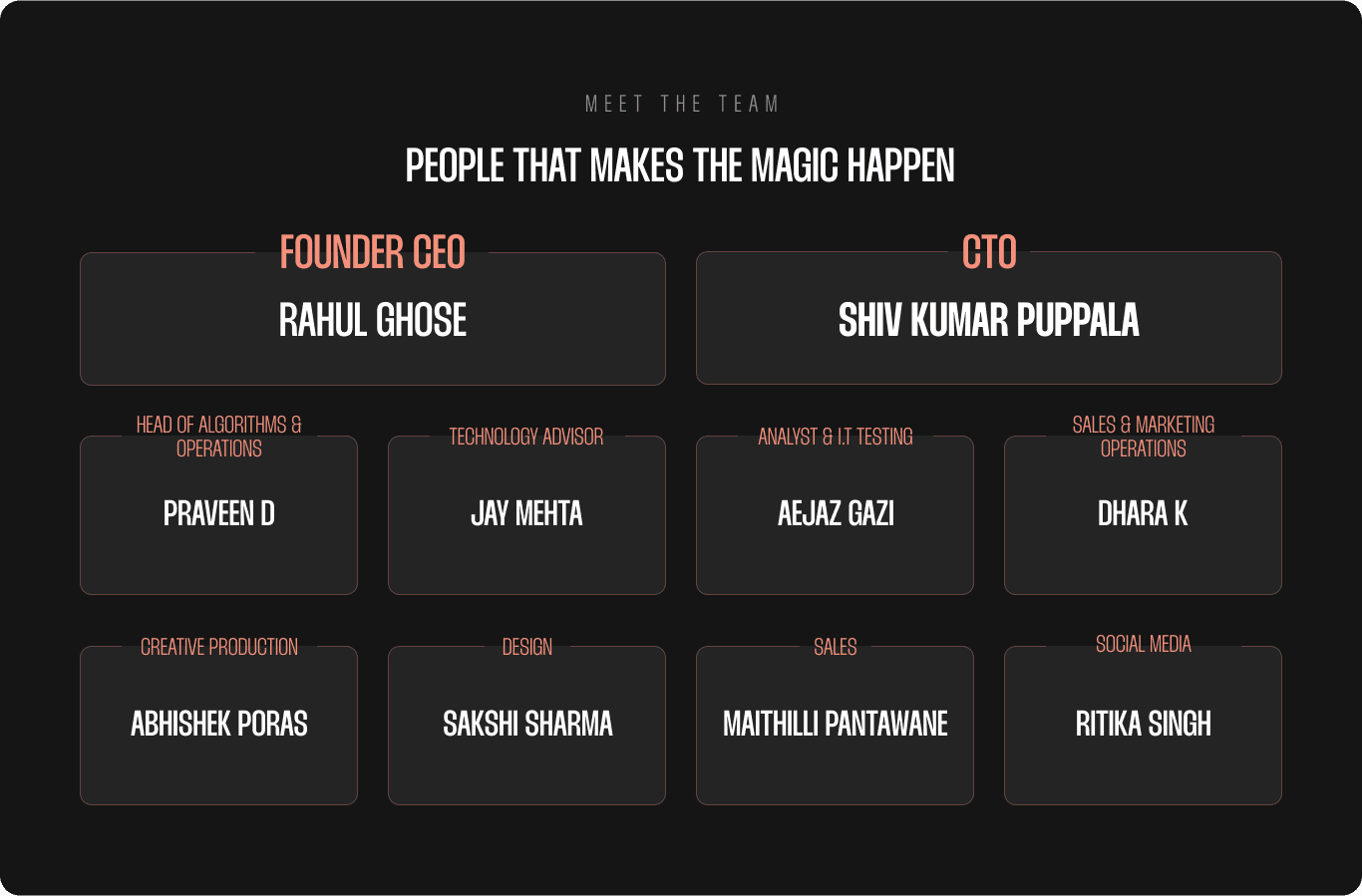
Team — We decided to showcase the founders more prominently on the website, followed by individuals in the subsequent levels of the hierarchy.
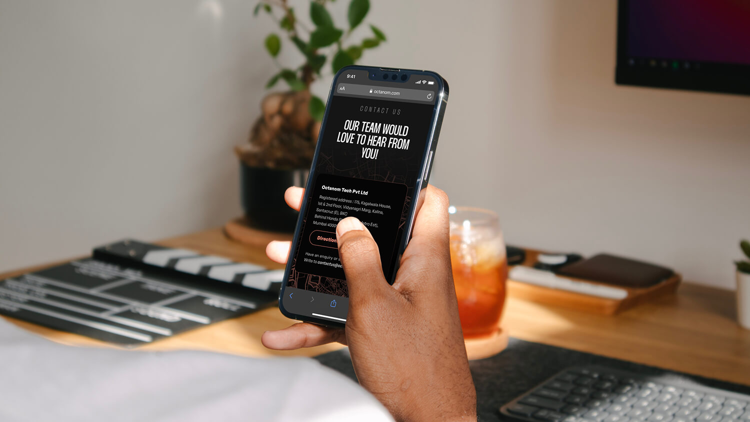
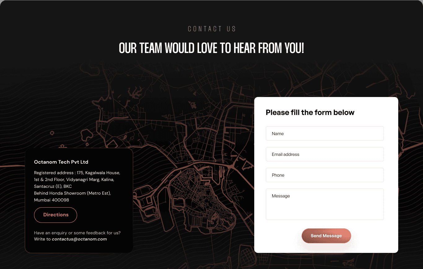
Contact Form — This section features a visually appealing background image that showcases the location of the head office. It also includes the company address prominently displayed on the left-hand side, while on the right-hand side, a contact form will be available for users to get in touch.
Footer — As a final touch, the landing page features a personal message from the CEO for the viewers. Additionally, we included links anchored to important sections of the page to enhance user navigation, along with our company's logo prominently displayed to reinforce the brand identity.

The Results
Our UI/UX redesign for Octanom Tech enabled the successful presentation of their two new platforms by educating users on the features of each, resulting in increased engagement even on social media content. The landing page's navigation was streamlined, and the visual hierarchy was improved, resulting in a more intuitive and user-friendly interface that met the needs of a diverse user base.
